
As someone who spends too much time thinking about streaming device home screens, I’m pretty excited about tvOS 17.2 for Apple TV.
Apple TV is my pick for best streaming box right now, and its latest software update includes an overhaul for the TV app, which acts as the main home screen by default. It includes a new sidebar for navigation, but more importantly, you can now filter the home screen by streaming service, giving you a more in-depth view of each catalog.
It’s a subtle change, but a notable one. No other streaming platform is doing this, and it brings Apple’s TV app tantalizingly close to being the ideal TV guide for streaming even if there’s still room for improvement.
The new Apple TV sidebar: Browse by app
The Apple TV app’s most conspicuous change in tvOS 17.2 is the new sidebar menu, which replaces the top tab bar in previous versions. You can bring up the sidebar by scrolling up past the top of the screen, clicking the back button from the top of the screen, or scrolling left from anywhere except the top feature carousel.
While the sidebar’s navigation options are similar to the old tab menu, it also introduces a new “Channels & Apps” section. From here, you can drill into the catalogs of Disney+, Hulu, Max, Amazon Prime, and other streaming services, all without leaving the home screen. The apps that appear in this menu are based on what you’ve installed and connected to the TV app.
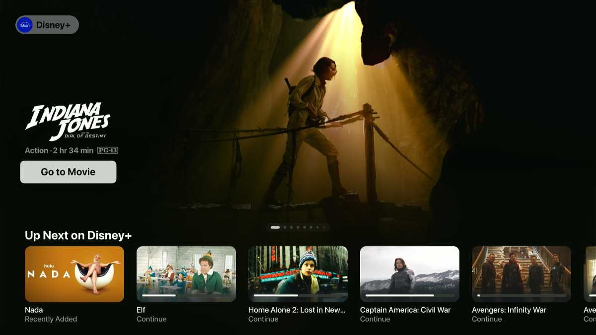
With tvOS 17.2, you can now filter Apple’s TV app by streaming service.
Jared Newman / Foundry
Why browse this way instead of launching those services’ respective apps? A few reasons:
- You get a consistent menu for every streaming service, including an “Up Next” row of what you’ve been watching, top charts, new arrivals, and recommendations.
- You can add movies and shows directly to the “Up Next” row on the main Apple TV home screen without watching them first, which isn’t possible once you’re inside an app.
- Clicking the info page for a movie or show brings up recommendations from across lots of streaming services, not just the current app. Same goes when you select an actor or director.
- Apple’s sidebar menu lets you quickly flip between streaming catalogs without switching apps.
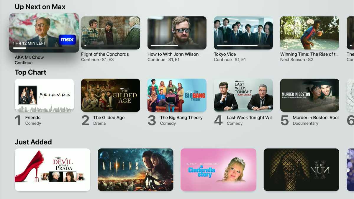
Apple’s TV app offers quick access to recently watched and newly added shows.
Jared Newman / Foundry
If you’re a fellow connoisseur of streaming home screens, this should register as a big deal. While other streaming platforms have their own ways of recommending content, none of them offer an in-depth way to browse through individual services. By contrast, Apple has come up with a more consistent, connected menu system for streaming; it feels like a missing piece that’s fallen into place.
(An aside: Apple has also discontinued its dedicated Movies and TV apps, which let you buy or rent movies and shows on demand. Those storefronts are already available inside the TV app, so removing them as standalone apps eliminates redundancy and reinforces the TV app’s role as an all-purpose streaming hub.)
What Apple’s TV app still needs
Apple’s TV app has come a long way since it launched in 2016, but it still falls just short of being the ideal interface for streaming. Using it in tvOS 17.2 brings to mind a few longstanding complaints:
Dial down the self-promo: Apple’s TV app is too aggressive about pushing Apple TV+ content. Even if you don’t subscribe, you’ll see recommendations in the top feature carousel, in the two rows directly beneath the “Up Next” list, and in the three rows after the “Channels & Apps” list. All that’s in addition to the dedicated “Apple TV+” section you can access through the sidebar.
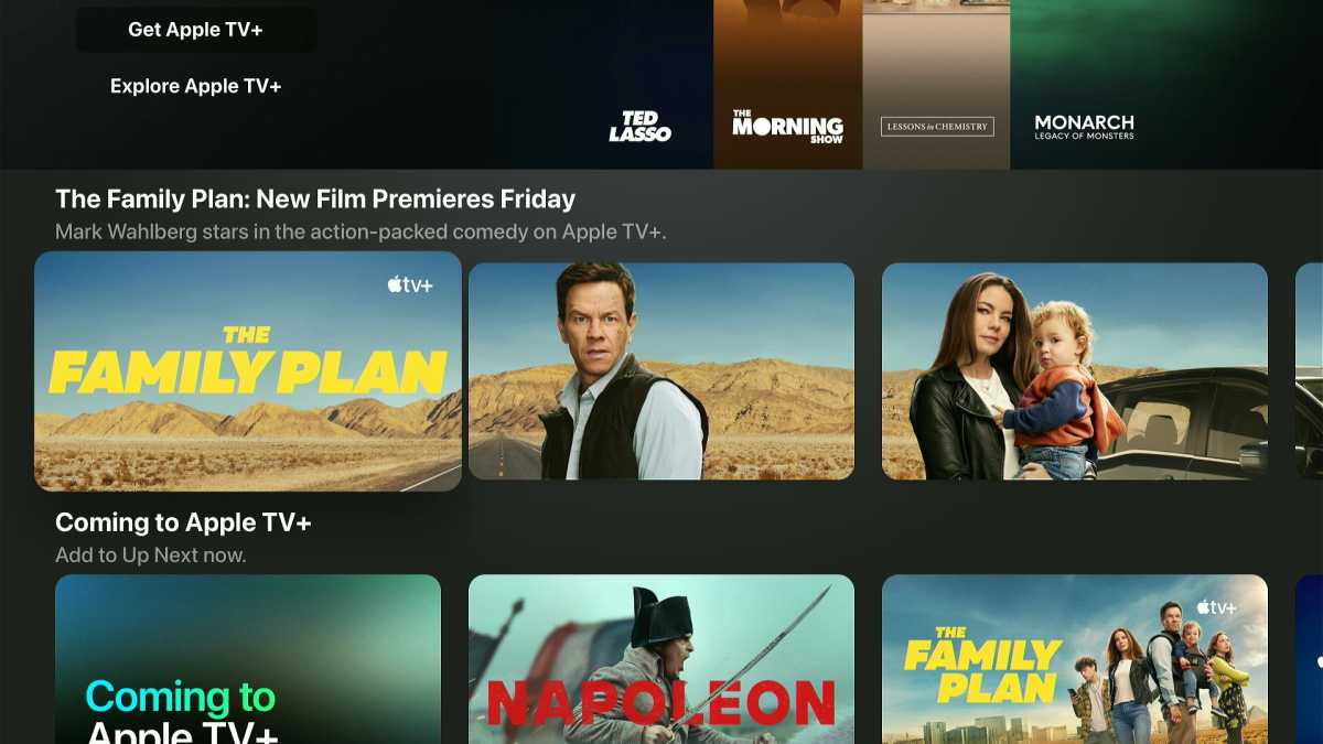
If you see an entire screen’s worth of self-promo, Apple blew it.
Jared Newman / Foundry
I get it: Driving subscriptions is a big part of the Apple TV business model, given that the home screen is otherwise free of obnoxious advertising. Still, Apple is trying way too hard here and risks driving people away from the TV app in the first place.
Netflix integration: Seven years after Apple launched its TV app, it still doesn’t tie into Netflix. That means you must open Netflix’s app directly if you want to browse its catalog.
Netflix has always been particular about integrating with streaming device home screens, and I have no special insight into why it’s averse to Apple’s version—something to do with data collection, in-app billing policies, or the lack of a Netflix button on Apple’s remote, maybe? All I know is it’s getting ridiculous, and it’s making TV worse for both companies’ users. I use my Apple TV almost every night, and this home screen blockade makes me less engaged with Netflix overall. The two companies should grow up and find a way to fix it.
An integrated app launcher: Today, Apple TV has two home screens: Click the remote’s TV icon once, and you get the TV app. Click it again, and you get a more traditional app launcher. The latter menu is necessary for games, general-purpose apps, and streaming services that don’t integrate with the TV app (like, say, Netflix).
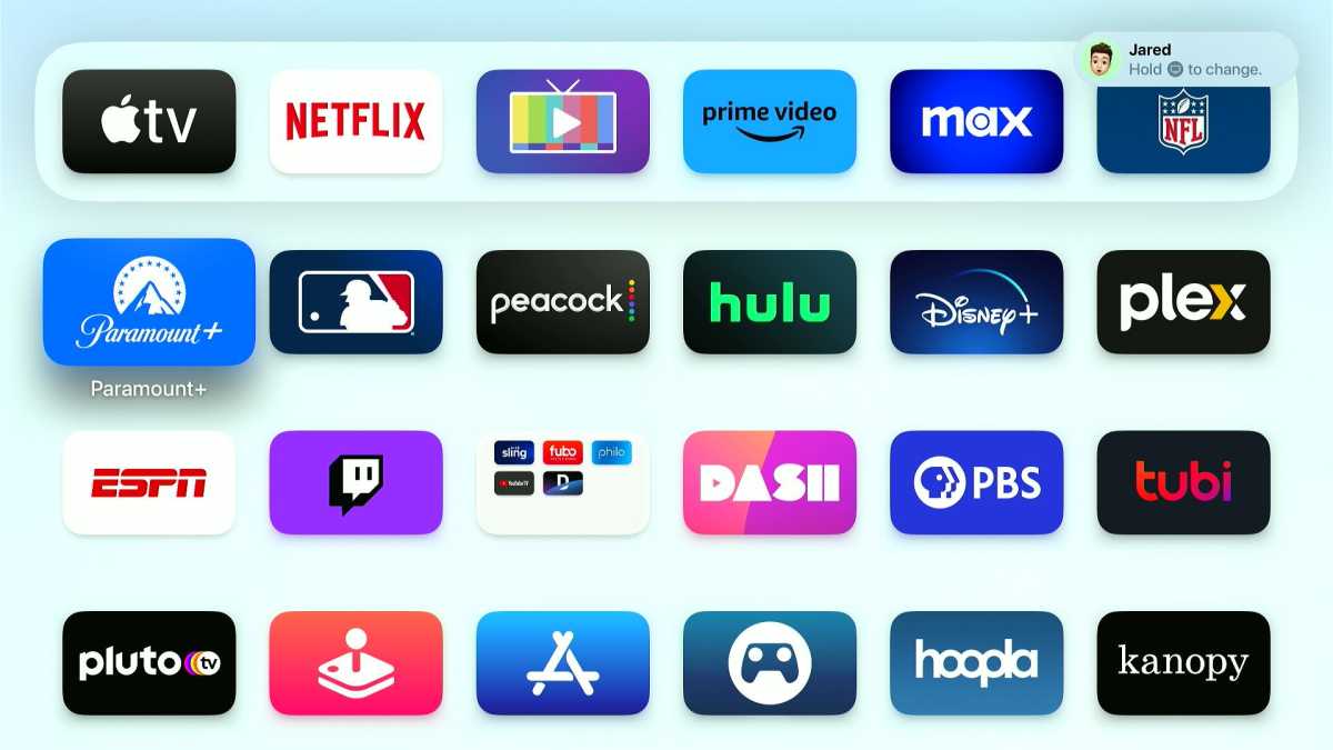
Clicking the Apple TV home button twice takes you here.
Jared Newman / Foundry
This duality has always been confusing, and Apple should find a way to get rid of it. The TV app’s new sidebar would be a great place to park an “All Apps” button.
I’m not saying Apple should eliminate the option to bring up the app launcher when you click the home button. (You can enable that under Settings > Remotes and Devices > TV Button.) But clicking that button should always accomplish the same action, not two different ones.
The race to build the best streaming guide has been going on for years now. With just a few more changes, Apple TV could easily be on top.
Sign up for Jared’s Cord Cutter Weekly newsletter to get more streaming TV insights every Friday.
Author: Jared Newman, Contributor

Jared has been a freelance technology journalist for more than 15 years and is a regular contributor to PCWorld, Fast Company, and TechHive, where he's written a weekly cord-cutting column since 2014. His Cord Cutter Weekly newsletter has more than 30,000 subscribers, and his Advisorator tech advice newsletter is read by nearly 10,000 people each week. Jared has a master's degree in journalism from NYU and specializes in making complex tech topics easy to understand, from streaming and cord-cutting to neat apps and useful tech tricks. He is based in Cincinnati, OH.